October 15, 2020

Thirty years after its inception, 4.57 billion people are now online. Yet instead of increasing diversity, the internet has become increasingly centralised and along with that, homogenised.
We’re now in a post-modern web design era where everything is derivative.
Or in other words - every website looks the same.
This isn’t just opinion, a series of data mining studies recently proved websites are increasingly similar.
Science confirms it: all sites look the same
As covered in more detail here and here, researchers from Indiana University decided to put the claim that websites are starting to look the same to the test.
They used AI to scrutinise 200,000 images across 10,000 sites. These included the sites of the biggest American companies, along with some of the internet’s most visited websites, using the internet archive to compare findings over time.
By comparing core metrics such as colour and layout they found that average differences between websites peaked between 2008 and 2010 and then decreased between 2010 and 2016. Layout differences decreased the most, declining over 30% in that time frame.
Or to sum it up, more sites are now following the same layout.
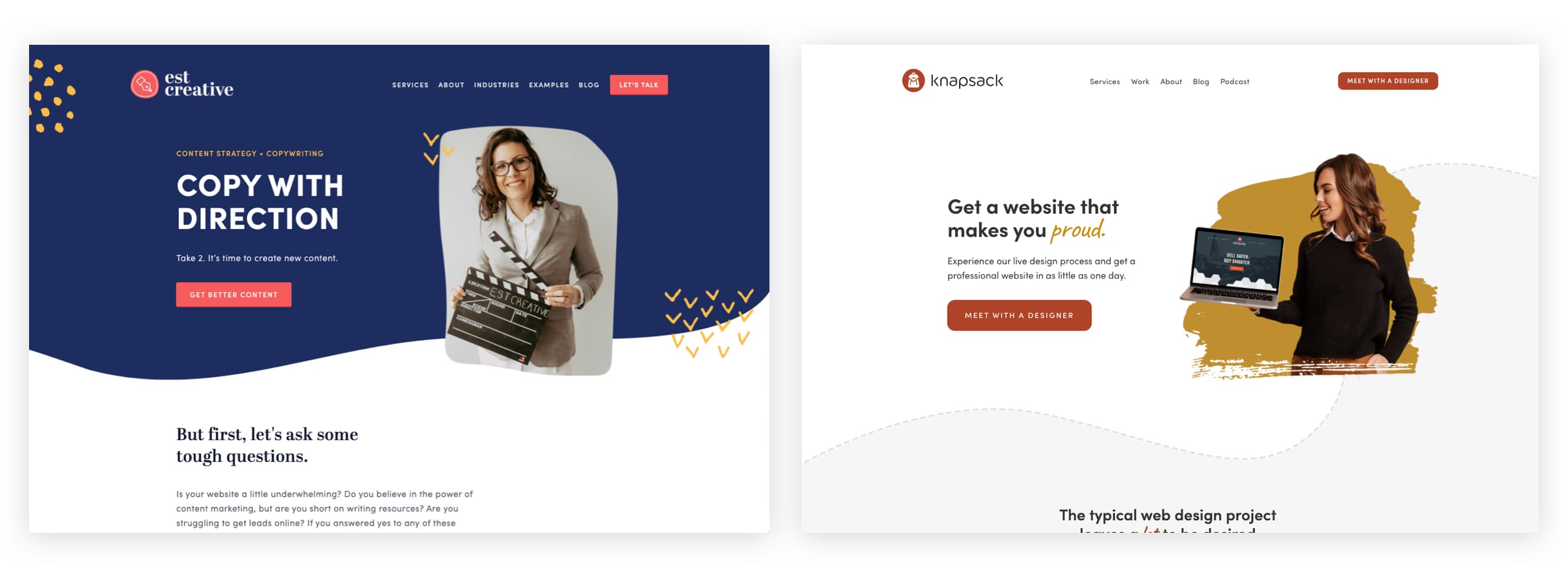
Just look at the example below. Here are two different agencies, one offering copywriting services and the other design. In this game of 'spot the difference', the only real thing that you could point out is a different colour palette.

Same, but different
As the researchers point out; “adhering to trends is totally normal in other realms of design, such as fashion or architecture”.
This may be but I’d argue that web homogenisation is also part of a wider internet-driven trend.
The connectivity of the web and rising globalisation has affected style trends and the way we consume on a global level.
In the past, you could probably identify what country someone came from by the clothes they wore. Now from Paris to New York to São Paulo - everyone can go to the same shops and buy the same outfit.
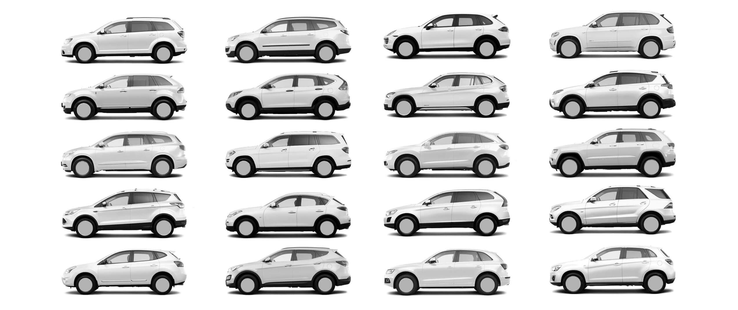
Even products look the same. Mobile phones are all just shiny black rectangles. Cars – as you can see in the graphic below – are also getting harder to tell apart.

How design tools constrain creativity
When I started out as a designer in the early 2000s, the big thing was using Adobe Flash to add animation, graphics and interaction patterns. Sometimes it was horrific.
But you could also do some fun and interesting things with it.
While I don’t recommend we return to the days of Flash (it wasn’t accessible for the visually impaired for one thing) it had no limits when it came to creativity and imagination.
Neither did Photoshop, which was the main program we used to layout websites until five years ago or so, which is when the research shows websites became increasingly similar.
Now sites are largely designed using code libraries, templated content management systems or programmes such as Figma or Sketch which are predicated on the idea that you will make a website based on common parts, components and reusable elements.
These constraints inevitably lead to similar-looking sites.
In fact, the research showed sites built with certain libraries—Bootstrap, FontAwesome, and JQuery UI—tended to look the most similar to each other.
There are good reasons for using these programmes and libraries. Standardised design can be great for accessibility and helps us make economies in terms of the time it takes to create websites. Which is useful in a world where everyone wants everything done yesterday.
However, it’s hard to create groundbreaking work if you’re doing it as fast as you can.
Lessons for brands
Few brands or businesses want to look the same as everyone else. Few designers want to create work that looks like everyone else's. But that’s exactly what’s happening.
On the flip side, for those companies that are willing to be brave, there’s a real opportunity to stand out. If you already have a product that’s similar to everyone else’s then you can’t afford to have a brand that’s identical, too.
At the same time, designers need to invest in doing work, better.
Lessons for designers
Life isn't an MVP and trying to do everything the cheapest, fastest way doesn’t usually end well.
In trying to get from A to B as quick as we can, we’re missing out C and failing to see the possibilities.
What I've witnessed, particularly with inexperienced designers, is that they never sketch ideas. They go straight to the computer and start working up the first thing they come up with.
"Computers are to design as microwaves are to cooking." - Milton Glaser
"Computers are to design as microwaves are to cooking." - Milton Glaser
Milton is a little strong here (I love computers) but they are just part of the creative process. While your first idea may well turn out to be amazing, you have to stress test first. Try things out and experiment with ideas that are interesting, brave and sometimes kind of strange.
Only then will you have made an informed design decision, not just taken the default path that will lead you – and your clients – to drown in the sea of sameness.
Be different, be better, be creative.


