Conversion rate optimisation (CRO) is NOT an art. It’s a science. Find out why it's better to treat your website less like a shopfront and more like a lab.
As I showed in my “Design Like A Scientist” webinar earlier this year, it’s better to treat your website less like a shopfront and more like a lab.
This means ditching the assumptions and following the evidence - getting to grips with your analytics, doing user research and running AB tests.
And just as a scientist follows tried and tested formulas, there are proven processes you can rely on to increase your conversions.
One such tried and tested formula is the LIFT model of CRO which uses the following six factors to improve trust and reduce friction for customers:
- Clear value proposition
- Relevancy
- Clarity
- Urgency
- Anxiety
- Distraction
In this article I’ll walk you through each one in turn, sharing examples from brands that are successfully applying them, so you can see how they might benefit you too.
Factor 1 - Clear value proposition
It’s critical that your website clearly articulates your products’ unique value and answers the age-old customer question, “What’s in it for me?”
Don't make your customers hunt for why your product or service stands out from the competition - because they won't. They'll bounce. Are your products ethically made? Has your service won an award? Do you provide free shipping and hassle-free returns?
Make sure you weave your value proposition through copy and design so it’s easy to understand and impossible to miss.
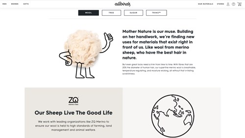
One brand that does this well is Allbirds, which displays its sustainable credentials front and centre and throughout its site and product descriptions.
Factor 2 - Relevancy to the customer
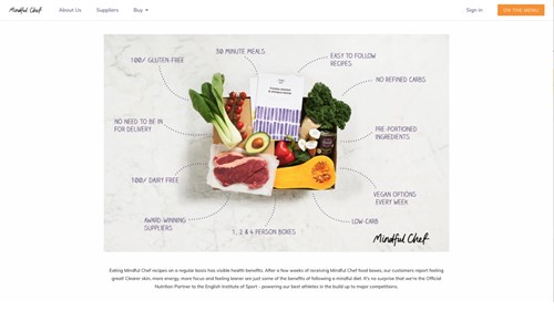
Does your site give customers the information they’re expecting to see? Does it meet their needs, answer their questions, and use words they can relate to?
As well as answering, “what’s in it for me?” your site needs to help answer, “is this product right for me?”
Showing relevance means providing the right information at every point of the journey – from landing page to check out to confirmation emails.
It’s tough to get this part right without customer research. However, here are some first-rate examples of brands keeping their online experiences relevant.
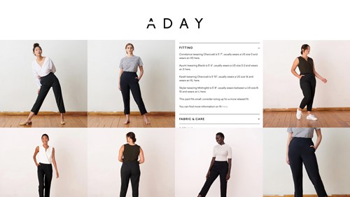
It’s hard to buy clothes that fit properly online without trying them on; ADAY overcomes this barrier by showing how their clothes look on people of all shapes and sizes.
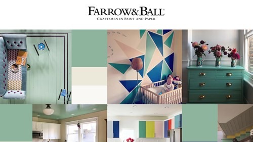
All paint colours look great in the sunshine, under studio lights or in picture-perfect homes. Farrow & Ball customers know this.
Showing their paint in different contexts and lights, particularly on dull cloudy days – we have rather a lot of those in the UK - serves to remove doubt and therefore increase sales.
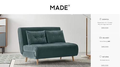
Made share delivery and returns information at a glance and all in one place, making it easy and reassuring to buy from them. Leave any room for doubt here and you’ll likely lose some sales.
Factor 3 - Clear and obvious interface
Do visitors understand what you are asking them to do? Do the UX and UI feel intuitive and follow standard practice?
From the ‘play’ button to the shopping cart symbol, you instinctively know the meaning of dozens of icons without even having to think about them.
As usability guru, Jakob Neilsen, states in his Law of Internet User Experience: “Users spend most of their time on other sites.
This means that users prefer your site to work the same way as all the other sites they already know.”
If your interface isn't using familiar or intuitive elements, users won’t stick around to learn how to use it.
For example, it’s still common to see ‘hamburger’ menus or hidden navigation that make products difficult to find.
Prioritise reducing the cognitive load for your customers and you’ll see an uplift in your conversion rate.
Factor 4 - Sense of urgency
Does the way you present the information spark an immediate reaction that makes people want to buy?
As the infamous toilet-roll drought of 2020 proved, scarcity – or perceived scarcity – can make people buy in droves.
Creating a sense of urgency is a tried-and-tested CRO factor that taps into this primal fear of loss. Without it, your customers would potentially put off buying, forever.
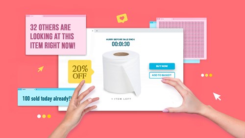
You can bet your TP hoard that a perceived scarcity, flash sale or surge in popularity will make more people “Add to cart”.
eBay does this well in its listings, by showing how many products have been sold in the last hour, how many are left and how many people are watching. Not to mention its ticking auction timer.
There are plenty of plugins out there that will do this for you, including countdown timers, stock counters and social proof pop-ups, such as Deadline Funnel or ProveSource.
Factor 5 - Anxiety creators
Does your site build credibility and trust? Do you have content, reviews, and social proof that address their questions and concerns?
While urgency works because it plays to our fears, it’s the one allowed exception. Every other element of your site needs to calm anxieties if you want your conversions to grow.
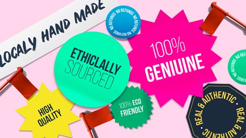
Be careful of claims that sound too good to be true, spelling errors or no clear refund policy. These will be seen as instant red flags and make your customers hit 'Close tab' not 'Buy now'.
This is because asking someone to give you their credit card details – especially if you’re not well known yet – requires a huge amount of trust.
Increase trust signals to help with this – such as security and payment symbols, Trustpilot reviews or media quotes.

Factor 6 - Distractions
What on the webpage is stopping your visitor from focusing completely on your message and call to action?
The final factor is the golden rule of CRO: Don't unnecessarily distract your customers from reaching your conversion goal.
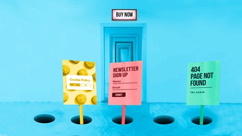
In a busy online world, anything that distracts, confuses or frustrates makes people bounce.
If a page is too slow to load, with too many pop-ups or links, your customers will simply give up and go elsewhere.
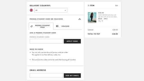
One major culprit is the prominent voucher code box at the checkout.
Unfortunately, these boxes feature prominently as part of many eCommerce CMS systems such as Shopify, even when a store doesn’t even offer discount codes.
If you’re wondering why this is a problem, ask yourself what you do when you see the option for a discount code? You go looking for one, right?
If you can’t find a code, there’s a massive risk you don’t complete checkout because you’re distracted or, even worse, you find a code for a competitor instead.
Think like a scientist
When it comes to navigating and buying from your site, people are wired to follow the path of least resistance. Your job is to address anything that will disrupt their flow or stop them from taking action along the way.
It’s not an easy task.
There are many hundreds of variables as to why, how and when people buy. Multiple paths to visiting your site and infinite distractions that cause them to flee, just as they’re about to check out.
This is why you have to think like a scientist, applying proven formulas, testing them and tweaking them, over and over. Do this and you WILL see your sales grow.
By the way, this is not to say I don’t believe in the art of design. It’s critical to differentiate your brand.
But when your business depends on conversions, you must master the science first.
