January 9, 2020

How to avoid stock photography clichés on your B2B website

Richard Trigg

Design Partner

Article 119

Share on

In the B2B world, it’s all too common to see websites and other marketing collateral use stock photography to ‘enhance’ comms.

Unfortunately, more often than not, overuse of cliché stock photography can have the opposite effect and be completely ignored or overlooked by your target audience. Why? Because you can spot it a mile away. It feels inauthentic, it usually has no depth of meaning, and in the worst cases it can even feel a bit lazy. These are surely not the types of adjectives any brand would want to be associated with, so why are businesses still sending these involuntary cues in their marketing efforts?

The answer we usually hear speaking to B2B businesses - and particularly professional services companies – is that they don’t really know what other options they have. We’ve heard this time and time again, and one of the first place any business can start is by answering ‘why?’ they do what they do, instead of the ‘what?’ it is they do. You guessed it, it all comes down to your brand purpose.

So what exactly do we mean by this - and what does this have to do with stock photography?

Let’s address this by using a very simple example in the business insurance sector. Below are live examples of different insurance companies’ business insurance landing pages:



AVIVA insurance website homepage

Direct Line Insurance website homepage
See the commonality here?

People on devices. When answering the ‘what’, it’s clear that these insurance companies provide quick quotes online. But how is this differentiating from a creative point of view? Imagine the possibilities if they attempted to answer the ‘why’ people are looking to buy business insurance. You end up with a much larger range of creative images that could cover themes such as ‘piece of mind’, ‘security’ or even ‘credibility’.

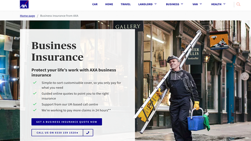
Take the AXA hero image in the same category below. Whilst this may well be a stock photo, it’s created a different look and feel that is already more engaging.

AXA Insurance website homepage

Now that we’ve got that covered, here are other strategies you can use to improve your brand creative.

1. Still use stock photography - but make it ownable.

Just to be clear, there’s nothing inherently evil with stock photography. They are cheap, easy to get your hands on, and can fill a gap in certain circumstances. But rather than taking an image at face value, consider what you can do to make it more ownable, more ‘on brand’.

Here’s an example of how we used stock photography in a rebranding project we completed for Peak AI, an AI software company:
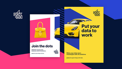


In the example above, we isolated specific elements within stock photography, layered this with the new brand palette and positioned them within the geometric forms that form part of the new brand system. When you push the creative of a stock photo like this, you end up with a very different end product - one that is truly ownable.

2 - Consider illustration

We’ve seen lots of B2B brands consider the use of illustration to overcome the issue of stock photography, but it’s no magic bullet. From a creativity stand point, there’s lots to think about if you want to go down the illustration route.
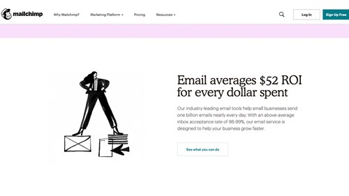
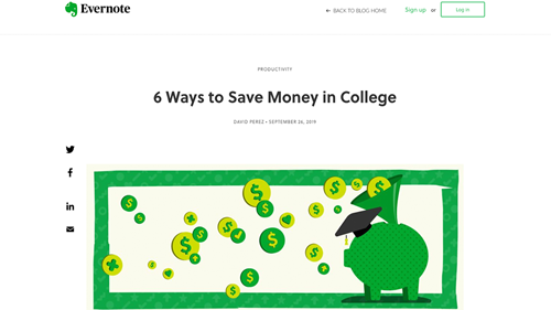

Firstly, illustration often conveys a certain tone of voice, one that is perhaps friendlier and more approachable, but could also be interpreted as whimsical and immature. You also need to consider how sustainable this strategy is; how many illustrations would you need to express everything you want to say? What’s the running cost of having an illustrator at the ready for any new content? If that illustrator isn’t available, will you be able to maintain a coherent style?

There are great B2B companies using illustrations that are very much part of their brand, like Mailchimp and Slack for instance.

Yet, it’s also easy to spot instances where illustrations can also fall into the cliché trap, like the example below…


3 - Include typographic elements

Another option that brands should perhaps consider is combining typography to imagery to create a new style. We came across this agency site the other day that this very elegantly.
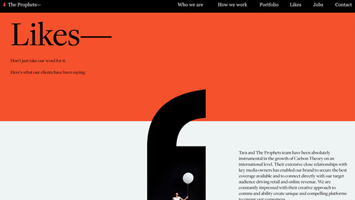
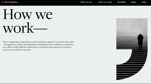


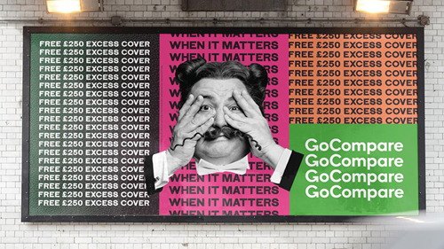
Going big with typography has been very on-trend of late and when done well, it can create a striking visual impact. But like all trends, some people in the design world think that big typography has jumped the shark since Go Compare’s latest out of home campaign.

4 - DIY photography

It’s also worth reminding you of the possibilities you could attempt with that device you carry everywhere with you- your mobile phone. Like many other agencies, we have pictures of our team on our website and we weren’t so keen on getting a photographer in every quarter to take new staff pictures to make them look consistent. Enter: portrait mode on our iPhones. We now take professional quality pics in our own environment in less than 5 minutes- and we’ve honestly never looked back!
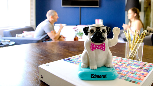
dog figurine waving. two colleagues in the background chatting

There’s something to be said about creating something that feels more authentic than polished sometimes. So much so in fact, that that’s even become a growing trend on social media, where the Instagram influencer aesthetic is making way to an unfiltered and candid vibe.

So there you have it… Next time you find yourself wondering how to capture the purpose of your brand through imagery, consider these feasible options. Or better yet, get in touch for loads of more ideas we haven’t covered here.